

Chart Patterns Cheat Sheet for Traders
📊 Master key chart patterns with this cheat sheet! Learn to spot trends, confirm signals, and make smarter trades in Kenya’s markets with clear, practical tips.
Edited By
James Carter
Chart patterns play a big role in the day-to-day life of traders and investors, especially in markets like Nairobi Securities Exchange (NSE) or even global platforms like NYSE and NASDAQ. Understanding these patterns helps in reading price movements and making smarter calls about when to buy or sell.
In this guide, we'll break down seven key chart patterns commonly seen in trading charts. Each pattern has its own story to tell about market sentiment and future price direction. Recognizing these can give traders an edge, whether one is dealing with stocks, forex, or commodities.

Trading isn’t about guessing; it's about knowing what the charts are telling you at a glance.
We'll cover what each pattern looks like, how to spot them reliably, and what they usually mean in terms of market momentum. The guide also dives into practical tips on how to apply this knowledge, including risk management strategies to protect your investment capital.
So, if you’ve ever felt lost trying to decode those zigzagging lines on a candlestick chart, this article is your shortcut to making those patterns work for you. From beginners to pros, there’s something useful inside for anyone looking to sharpen their technical analysis game.
Chart patterns serve as a trader’s roadmap to understanding market behavior. They give a visual summary of how prices have moved and hint at where they might head next. For example, when examining the Nairobi Securities Exchange charts, recognizing these patterns can provide a local trader a leg up in anticipating stock movements before the crowd catches on.
Traders often rely on chart patterns because they condense complex price information into shapes that are easier to interpret. This helps in making quicker decisions, especially in fast-moving markets where hesitation can cost gains. Specific patterns like the head and shoulders or double tops frequently appear across many asset classes, making them universal tools in chart analysis.
Using chart patterns effectively isn’t just about spotting shapes; it involves interpreting them in context. A double bottom pattern during a downtrend might signal a potential reversal, suggesting it's time to consider buying. Conversely, spotting a cup and handle might hint at a bullish breakout ahead. By learning these patterns, traders improve their ability to time entries and exits, reduce guesswork, and protect their investments against sudden shifts.
Overall, this section sets the stage for understanding how chart patterns reveal the hidden psychology of market participants and why they remain valuable tools in both simple and sophisticated trading strategies.
Chart patterns represent the collective psyche and behavior of buyers and sellers over time. They tell a story of market sentiment — whether optimism is running high or caution is creeping in. For instance, a rising wedge pattern often signals that buyers are losing steam despite rising prices, potentially foreshadowing a drop.
Essentially, these patterns capture shifts in supply and demand balance. When many traders buy aggressively, an ascending triangle might form, indicating strong demand pushing prices upward. On the other hand, a head and shoulders pattern reflects a weakening uptrend, where sellers start to dominate after a period of bullish momentum.
Think of chart patterns as traffic signs on the price road: they warn you where turns and stops might come. Without these signs, navigating market moves is like driving blind. Experienced traders examine these cues closely to gauge market consensus and likely next moves.
Understanding chart patterns matters because it arms traders with a predictive edge. Instead of relying purely on gut feelings, traders use proven shapes to anticipate price changes, which can lead to better timing and risk management.
For example, imagine a trader spots a double top on Safaricom’s stock chart. Knowing this pattern often signals a downtrend could be about to start, the trader might trim profits or tighten stop losses to preserve gains. Without this insight, they might hold through the decline.
Furthermore, pattern recognition helps traders align their strategies with the market’s rhythm, reducing emotional trading. It encourages a more disciplined approach, where decisions have a basis in historical price behavior, not just rumors or guesswork. This practical edge is vital in volatile markets like forex or commodities where sudden swings are common.
Spotting and interpreting chart patterns is like reading the market’s mood swings; it helps you act smart, not just fast.
Knowing how to recognize common chart patterns is like reading the market's little hints before it makes a move. It’s not just about memorizing shapes; it's about understanding what they tell us about trader behavior and potential price swings. These patterns give traders an edge by providing signals where prices might be heading next, whether it's a shift in direction or a continuation of the current trend. Imagine spotting a head and shoulders pattern on your chart — that often signals a setup for a trend reversal, meaning it’s time to think twice before holding onto a position blindly.
Familiarity with these patterns helps reduce guesswork. Instead of reacting emotionally to price moves, traders can make more calculated decisions. For example, the cup and handle pattern often points toward a bullish continuation, giving traders confidence to enter or add to long positions. Recognizing such signals in real-time charts can really make a difference, especially in markets where timing is everything.
The head and shoulders pattern features three peaks: the middle peak (the head) flanked by two lower peaks (the shoulders). The pattern’s defining trait is its symmetry and the neckline that acts as a baseline connecting the lows between these peaks. What stands out is how the price tends to climb, peak, fall, spike to a slightly lower height, then fall again, creating a distinctive shape. This setup reflects a battle between buyers pushing prices up and sellers trying to push down, often signaling that the momentum is about to flip.
This pattern is often called a reliable herald for trend reversals. When it appears after an uptrend, it suggests the bullish momentum is losing steam — sellers are starting to take over, setting the stage for a downward move. Traders look to this pattern to exit longs or prepare for shorts. One practical tip is to wait for the price to break below the neckline on higher volume; that's when the reversal confirmation kicks in.
Look for three peaks where the middle one is noticeably taller than the other two, and the neckline drawn across the lowest points between peaks is generally horizontal or slightly sloped. Volume tends to decrease during the right shoulder formation and then spikes when breaking the neckline. Using charts from platforms like MetaTrader or TradingView can make spotting these patterns easier by zooming in on weekly or daily charts where these patterns tend to form more clearly.

Picture a rounded bowl that forms the "cup" followed by a small pullback that shapes the "handle." This pattern shows a gradual change from bearish to bullish sentiment. The cup typically takes several weeks or even months to form, signifying a slow consolidation phase where prices dip and recover steadily. The handle forms afterward as a short period of sideways or slightly downward price action, often resembling a small flag or pennant.
Once the price breaks above the handle’s resistance level, it signals a strong bullish momentum and a likely uptrend continuation. Traders see this breakout as an entry point because it often follows with solid buying activity. The pattern reflects growing confidence among buyers, pushing prices to new highs. In practice, traders set stop-loss orders just below the lowest point of the handle to manage downside risk.
Look for a smooth U-shape cup rather than a sharp V-shape, as a smooth curve suggests a stable base. The handle should not retrace more than a third of the cup's advance to maintain the pattern’s strength. Volume usually contracts during the handle formation and picks up sharply on breakout, giving another confirmation signal. Keeping an eye on these volume changes can save you from false breakouts.
A double top looks like an "M" shape and usually signals that an upswing has hit a resistance level twice and may be ready to drop. A double bottom, in contrast, resembles a "W" and indicates a support level has been tested twice, suggesting that the price might rise.
Double tops often warn that the bullish push is overextended, leading to a price decline. Double bottoms hint at a market bottom and potential bounce back upwards. Both patterns signal trend reversals but in opposite directions: double top for bearish reversal and double bottom for bullish reversal.
Confirm the pattern by a break below the low point between the two tops or above the high point between the two bottoms. Volume tends to rise when the second peak or trough forms but often fades, indicating weakening momentum. Spotting these patterns early can mean the difference between locking profits or watching the market slip away.
An ascending triangle has a flat resistance level with higher lows that push prices up toward it, creating a triangular shape pointing right. A descending triangle is the opposite, with flat support and lower highs pushing prices downward. These shapes indicate where buyers and sellers are battling it out, building tension before a breakout.
Ascending triangles often break upward, as buyers gain strength pushing through resistance. Descending triangles more commonly break downward, indicating sellers dominate. However, breakouts can occur in either direction, so confirm with volume and other indicators.
Traders use these patterns to time their entries; buying near the flat resistance line of an ascending triangle or selling near the support of a descending triangle before the move. Setting stop-loss orders just outside the triangle boundaries is a common risk control method. Watching volume spikes on breakout confirms the move and increases confidence.
Recognizing these common chart patterns is one of the most practical ways traders can interpret market psychology and price action, enabling more informed and confident trading decisions.
When it comes to learning chart patterns, having a go-to resource at your fingertips is a game-changer. PDF guides fit the bill perfectly—they're easy to carry, quick to reference, and usually packed with clear visuals. Traders often struggle to remember every detail about patterns, especially when charts can look messy in real-time. With PDFs, you can pause, review, and digest the concepts at your own pace, whether you're at your desk or on the move.
PDF guides are like a trading buddy you carry in your pocket. Unlike bulky textbooks or video tutorials that require internet access, PDFs work offline and load instantly on your phone or tablet. This portability means you can glance through chart patterns during your commute, while waiting for meetings, or even trading floor breaks—maximizing your study time without needing a laptop. Many traders keep a collection of PDF sheets organized by pattern type or difficulty level, making it simple to jump right into concepts relevant to their current focus.
Nothing beats seeing a good old-fashioned diagram when it comes to spotting chart patterns. PDF guides often include plenty of annotated charts and color-coded highlights that show exactly what to watch for—like a double top’s twin peaks or a cup-and-handle's curved bottom. These visuals break down complex info into digestible bites, helping you recall patterns on live charts. Plus, some PDFs offer step-by-step walkthroughs, showing how patterns evolve over time, which deepens your understanding beyond just definitions.
Going through multiple examples in a PDF guide is crucial. Don’t just look at a couple and call it a day—flip through a variety of chart snapshots across different markets and timeframes. This exposure trains your eyes to recognize the subtle differences, like a misformed head and shoulders or a weak breakout that might not pan out. Regularly revisiting these examples keeps patterns fresh in your mind and sharpens your intuition.
Keep a checklist while reviewing PDF examples: What signals are present? How was volume behaving? Did the pattern fail or succeed? This habit turns passive reading into active learning.
Passively reading won’t make you a master. After reviewing, test yourself by opening live charts or backtesting historical data to spot patterns without peeking at guide answers. Use PDFs as a safety net—when unsure, refer back to diagrams and notes to confirm. This back-and-forth strengthens pattern recognition skills and helps you distinguish genuine setups from noise.
PDF resources are not just educational; they should inform your actual trading moves. Begin by picking a few reliable patterns you understand well from your PDFs and craft specific rules around them—like setting entry points, stop-losses, and profit targets based on past examples. This structured approach reduces guesswork and emotional trading. Keeping a PDF open during strategy review sessions helps keep your plan aligned with tested patterns and stops you from drifting into unsupported setups.
In short, using PDF guides smartly can streamline your learning curve and boost confidence when applying chart patterns in real market scenarios. Take advantage of their mobility, detailed visuals, and comprehensive examples to build a solid foundation and practical edge.
Incorporating chart pattern analysis into your trading moves beyond just spotting shapes on a screen. It’s about blending these patterns with other tools and methods to get a clearer, more reliable read on market behavior. Patterns alone can guide you, but their real strength lies when paired with other indicators that confirm or question what the charts suggest. This integrated approach helps traders make smarter decisions, avoid unnecessary risks, and ultimately build strategies that hold up in changing market conditions.
Volume is like the heartbeat of the market—knowing the how many shares or contracts are changing hands gives you deeper insight into the strength or weakness behind a price move. When you see a pattern like a breakout from a cup and handle, spotting increased volume confirms that the move is backed by real market interest rather than just a fluke. Conversely, if the volume is limp or fading, it’s a red flag signaling that the breakout might stall.
For example, during an ascending triangle, rising volume on a breakout day can sharply increase confidence that the price will continue upward. Without volume support, that breakout is just wishful thinking. So, pairing chart patterns with volume data can be a quick way to filter the good signals from the noise.
Moving averages smooth out price data to help you identify trend directions over time. When used along with chart patterns, they act like a guide rail. Say you spot a double bottom pattern indicating a potential trend reversal from bearish to bullish. If this pattern coincides with the price crossing above the 50-day moving average, that’s a stronger signal to enter a long position.
Using different moving averages—like the 20-day and 200-day—lets traders spot momentum shifts and potential support or resistance levels, confirming what the pattern hints at. For example, a head and shoulders pattern right near a long-term moving average could carry different weight depending on whether the price breaks above or below that average.
Combining chart patterns with volume and moving averages doesn’t guarantee success but adds layers of validation that are essential for making solid trading choices.
Not every chart pattern plays out as expected, and false signals can lead to costly mistakes. For instance, a false breakout happens when the price breaks a pattern boundary but quickly reverses, trapping traders who acted too soon. This often happens in volatile or low-volume markets where price swings can be erratic.
Managing this risk means being patient and looking for additional confirmations—like waiting for two or three candles to close beyond a breakout point or checking if volume supports the move. Also, setting sensible stop-loss points helps mitigate damage if the pattern fails to deliver.
The reliability of chart patterns depends a lot on the market environment. In trending markets, patterns like flags and pennants tend to work better because price movements are directional and more predictable. But in sideways or choppy markets, these patterns frequently give mixed messages or fail.
During major news events or economic upheavals, normal pattern behavior might get tossed out the window as traders react emotionally or herd instinct takes over. This means no matter how perfect a pattern looks, external factors can override its usual meaning.
Ultimately, recognizing these limitations means you don’t put all your faith in patterns alone. They are a piece of the puzzle, working best when paired with a flexible mindset and additional research.
Understanding chart patterns goes beyond just recognizing shapes on the screen; it’s about making informed decisions that can increase the odds of success in trading. Wrapping up, it's clear that chart patterns act as signals within price movements, offering a glimpse of what might come next. When combined thoughtfully with other tools, these patterns become a powerful part of a trader's toolkit.
Chart patterns like the Head and Shoulders, Cup and Handle, and Triangle formations each carry unique market stories. For example, spotting a Double Top helps anticipate a potential price dip, while recognizing an Ascending Triangle points to possible bullish momentum. The key is to not rely on patterns in isolation but to look at volume, trend context, and momentum indicators alongside. This layered approach reduces the risk of falling for false signals, which happen more often than one might hope, especially in volatile markets.
Patterns also guide timing. Take the Cup and Handle; entering right at the breakout point can make the difference between capturing nice gains or watching value slip away. Real money management, like setting stop-loss levels based on pattern structures, is vital to protect capital.
For traders eager to build on this foundation, the best next step is consistent practice. Using PDF guides with clear diagram examples, or charting software like TradingView, to review and annotate live charts daily is invaluable. Try marking out patterns on historical data and comparing actual price movements to predictions made.
Joining forums or local trading groups can offer fresh perspectives and real-world feedback that no textbook can match. Podcasts, webinars, and well-known trading courses from sources like Investopedia or Coursera add depth but pair learning with hands-on experience.
Remember, the market isn’t static, and neither should a trader's learning be. Staying adaptable, honing pattern recognition skills, and applying critical thinking keeps you ahead—turning simple shapes on a chart into actionable insights that drive better trading outcomes.
Trading chart patterns are not a crystal ball, but with the right approach, they become a practical guide that helps manage risks and spot opportunities more clearly.
📊 Master key chart patterns with this cheat sheet! Learn to spot trends, confirm signals, and make smarter trades in Kenya’s markets with clear, practical tips.

📈 Learn to spot key chart patterns in trading and investing. Understand types, significance, and interpretation to make smarter market moves in Kenya's financial scene.
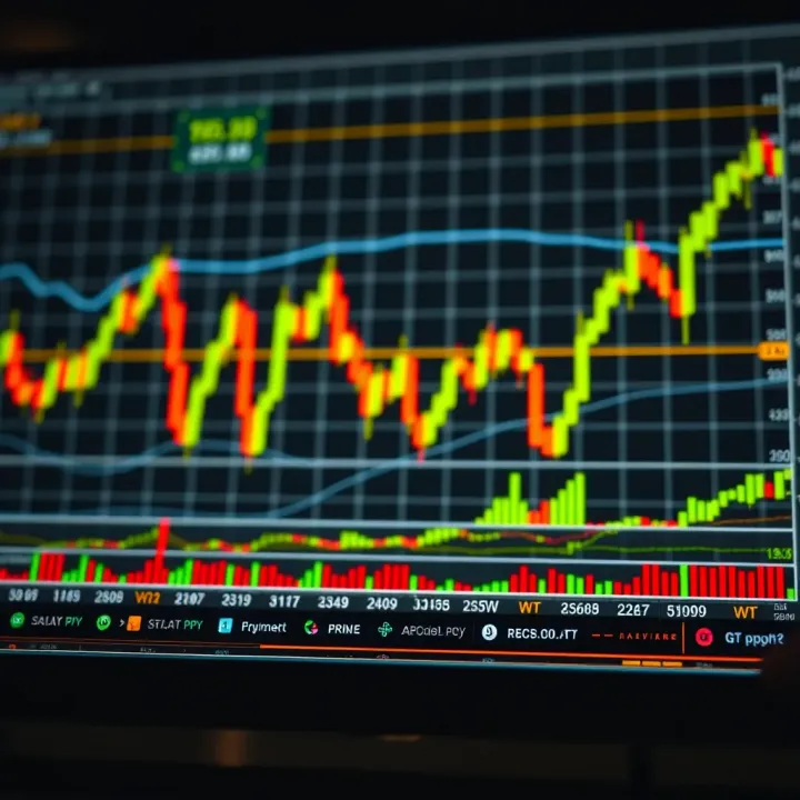
Learn key chart patterns for trading 📊 with expert tips and free PDFs to boost your investing skills. Perfect guide for traders in Kenya 🇰🇪.

📊 Learn to spot key forex chart patterns and use them effectively in your trading strategy. A clear, practical guide for Kenya’s forex traders.
Based on 9 reviews